The strength and beauty of words

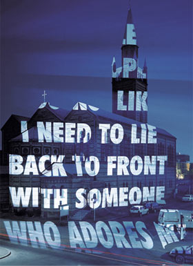
Xenon on Berlin’s Matthäikirche, 2001 © Jenny Holzer


Born in Ohio in 1950, Jenny Holzer is an artist who, over the past three decades, has been consolidating a beautiful and impressive work in the visual arts. In spite of her flirting with the abstract arts at the beginning of her career in the late 70’s, when she moved to New York, Holzer chose the word as the driving force of her work, and began to use non-conventional media such as billboards, LED panels and lighting projections to convey both dimensions that make up a word: form and content.


The texts used have different origins: many of them are her own writings, others are internationally known poems, others are even extracted from governmental documents. But Holzer uses this diversity to work in a single line, which speaks of universal values and establishes counterpoints that deeply touch us all: the public and the private, the political body and the physical body, the universal and particular.


More impressive, however, is Holzer’s counterpoint between form and content: we see, at one time, sensitivity and strength, gigantism and fluidity, frailty and perennity – all with a plastic result of unarguable beauty.


It is impossible to stand indifferent when faced with one of Holzer’s pieces of artwork. The strength of her words beautifully invades our eyes, our minds and our souls.


To learn more: www.jennyholzer.com
“ProtectProtect”, Jenny Holzer Exhibition at Whitney Museum, NYC, 2009 (video)

Multiple choices

Pantone®Guide


Sample books have been used since the sixteenth century as working tools for all areas of the decorative arts. With the purpose of experimentation, documentation, marketing or distribution, they are endowed with refined beauty since it offers countless possibilities of colors, shapes, forms or textures, and provide the perception of variety – and by doing so in an orderly fashion, they allow understanding and pleasure. (Quoting Montesquieu: “It does not suffice it to show many things to the soul: we must do it in order, to be able to remember what we saw and begin to imagine what we will see; the soul thus rejoices for its extent and its ability to penetrate”.)


On this theme, in 2008 the Cooper-Hewitt Museum held a wonderful exhibition called “Multiple Choices – From Sample to Product”. The samples ranged from sales catalogs with replica buttons of the French industry of the eighteenth century to tiles resembling the porcelain colors of Sèvres, to the latest Pantone® Guides notebooks, books and objects of unparalleled beauty, capable of filling our eyes and taking our breath away.


The contact with such universe of colors, shapes and their infinite associations results in a sensory experience able to provide our soul with different and infinite pleasures. A beautiful example is the PantoneHotel, inaugurated almost a year ago in Brussels. By inviting people to “experience Brussels through the lens of colors”, the hotel assigned to each of its seven floors different color palettes, thus aiming to provide its guests with different sensations – and therefore, different pleasures.

The planet blue on the sun road


This is the title of an acoustic show that Milton Nascimento performed at the Cultura Astistica Theater, in São Paulo in October 1991. Only three performances resulted in a CD under the same name, unfortunately too little known by the public and, today, off the shelves in Brazil (it can be found at amazon.com).


Milton always favored the interpretation of his own songs. Here, in contrast, he performs as an interpreter, singing and playing (guitar, piano and accordion) songs of other composers – only four out of the 11 songs in the CD were written by him. And in this surprise lies a huge enchantment.


Milton’s singing transcends all expectations. A musician with unique sensitivity and a clear voice, his interpretations are both passionate and exciting. With a firm identity on the essence of each song, he, through the filter of his emotion, reveals such essence in a surprising and overwhelming way. And in his voice, we listen to once familiar songs as if they were new songs.


Milton sings not only his voice – above all, he sings his soul. And every word sung by this soul touches our souls with rare delicacy. Milton has the exact measure of the pleasure every song can and must provide to people.


For a taste of it: Hello Goodbye (Lennon & McCartney)

Why Chanel

Photo :: Gabrielle Chanel


Almost 100 years after her first creations, Chanel is still revered in the fashion world – and outside as well. In an era when products, thoughts and relationships are increasingly ephemeral, one should wonder why such a long stay.


Freeing the woman from rigid attires at the end of the nineteenth century (which favored ostentation at the expense of comfort), Chanel reproduced, on an industrial scale, her own image – a distinctive image in absolute harmony with her personality and the historical moment in which she lived. And here lies the secret of her stay in the collective imagination for so long: we are not fascinated by her clothes, necklaces or perfumes – we are fascinated by her identity both strong and unique, which is revealed to us through the objects she used and (re)produced.


Some say that the intensity of Chanel’s presence annulled those of her rivals. It doesn’t seem to me, however, that this fascination came from the objects she chose to wear… On the contrary, such objects were personal and conscious choices, result of the intensity of her thinking – and of the understanding that, also by dressing, she expressed her own identity.


Ironically, the industrial production of a unique personal style has become a paradox – to the point when Chanel herself stated: “I am no longer what I once was: I must be what I have become.” The desire for a socially recognized and valued image combined with the lack of knowledge and reflection on oneself make thousands of people seek in bags, shoes and clothes the ability to grant them personality and identity, in a total reversal of roles.


As I once wrote in the text ‘About dressing’ (Jan, 2011), beauty lies in being and perceiving ourselves as unique. Beautiful, therefore, is not to own Chanel – beautiful is to be Chanel.

Bewitched


‘A cidade enfeitiçada’ (‘The bewitched city’) was the first song by Paulo Gusmao I ever heard. And such was my delight – by the title (so inspiring!), the composition and his arrangement – that I decided to immediately search information on this composer I didn’t know.


The song title baptizes the CD – and no less inspiring are the titles of other songs in it: ‘Flor de outono’ (‘Autumn Flower’), ‘O brilho do vagalume’ (‘The firefly’s glow‘), ‘Sua silhueta sutil’ (‘Its subtle silhouette’)… not to mention ‘Romance em Vila Humaitá’ (‘Romance in Vila Humaitá’), gently broken into three acts.


The album’s 15 songs captivate, enchant and thrill. Melodies and harmonies reach our ears lightly and gently, seeming to float. Arrangements establish subtle dialogues among the accordion, the flute, the guitar and other instruments, creating an atmosphere that exudes grace and elegance. You can’t get enough of it.


‘A cidade enfeitiçada’ (‘The bewitched city’) is indeed bewitching. High quality Brazilian and contemporary instrumental music, touching the ear with sweetness, the soul with beauty, and fills us with pleasure.


Enjoy it at www.paulogusmao.com.br.

The borders of design

Olive Street nº1 :: byHenzel


There are objects that, even if produced with high technology, according to a specific project and on an industrial scale, are displayed before our eyes with the power of artwork, unique and manufactured. They take on a “subject” role before the observer rather than mere “objects”, surprising for their originality, touching for their unique beauty and tempting for the ability to subvert existing standards. These objects drive us out of our comfort zones and demand from us a new perspective and a new reflection on what we thought we knew.


The rugs created by Henzel Studio are like this – they question, test and transcend boundaries that often persist between design (in this case, interior) and art. The starting point is a fresh look at this object, so familiar (?) to all of us… And the result is invariably stunning.


There is no doubt that, without technical excellence and high quality materials, it would be impossible to materialize in wool traits and colors that seem to have come out of paintings, graffiti and watercolors. But if these rugs speak to our soul, it’s because behind the technical excellence and quality materials, another soul is released to them, willing to turn them into a new medium of expression. To do so, it questioned the conventions, overthrew patterns, uses and purposes, and thus redefined not only a new world of colors, images and treatments for this object, but also the relationship we establish with it.


Restlessness, nonconformism and passion are key tools to open our minds and our hearts, allowing us to break free to the new. And our soul needs the new – (re)discovering shapes, colors, uses and relationships, we can create and enjoy, every day, new sources of beauty and pleasure.


To learn more: www.byhenzel.com

Paint or dye, but love me


Paint or dye but love me is the title of this beautiful conceptual project developed in 2008 by John Nouanesing, a young product designer who lives in France. Contrary to what one might imagine, the visual tension created by shapes that seem to be in constant ‘suspension’, and by the vibration of a very intense red, makes it a great pleasure to observe this artwork.


John Nouanesing seems to always have the same three guiding principles in his creative process: observation, innovation and irreverence. It is curious to see how each of his conceptual projects is able to tell us a story, making us see clearly the conceptual path traveled, from the very first insight to the final result.


These results are not always so beautiful – and not always effectively achievable. But it’s always a delight to see these objects and the entertaining titles assigned to them by John Nouanesing.


Learn more at www.johnnouanesing.fr

David Trubridge

Coral lamp :: David Trubridge


I first saw David Trubridge’s Coral Lamp at Soho’s DWR in NYC, about two years ago. From classics of the 20th century to contemporary pieces created by talented yet little known artists, the furniture and objects found in these U.S. chain stores are always very well selected, grabbing everyone’s attention for their beauty and elegance, and sometimes – like in this case – also for their innovation.


The lamp was placed in a more intimate atmosphere at the back of the store, and the effect of light and shadows created by its full and empty traits was overwhelming. I was also touched by the counterpoint there seemed to be in the essence of that object: how is it possible to obtain a result as delicate and organic from the assembly of a jigsaw puzzle whose pieces are all identical, rationally designed and industrially (re)produced?


A quick search on the designer has shed some light on this question: majored in naval architecture in England, lived on a boat for 5 years and then began designing furniture; his wirk uses wood from sustainable plantations and his projects seek to obtain maximum effect from minimum material; in addition, David believes in durability as a key attribute of good design and in art as a driving force of human development.


Upon learning this story, I could understand that the pleasure I felt by observing this lamp had not only elapsed from the appreciation of its beautiful shapes or visual effects, but also from the perception of its soul. I believe that the soul, when present in things, talks directly with ours – and this conversation encompasses the reasons for tastes and pleasures we are capable of feeling.


To learn more:
 www.dwr.com
www.davidtrubridge.com