Simplicity and style
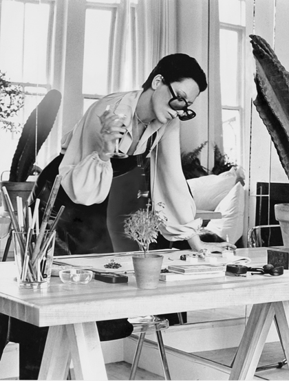
Elsa Peretti :: photo by Duane Michals :: Vogue, 1974
Elsa Peretti is perhaps the greatest responsible for the contemporary image of Tiffany & Co. Since her first collection for the brand in 1974, the Italian designer has been creating beautiful objects and jewelry that are characterized by an organic simplicity and an unmistakable formal elegance – attributes that have kept her work among the best sellers of the company over the past 40 years.
Born in Florence in 1940, Elsa revealed her creative, curious and free spirit in a very early age. Daughter of a magnate of the oil industry, while still young she distanced herself from her conservative parents to spend time in Switzerland, and teach Italian and ski. Back in Italy, she graduated in interior design in Rome and, after breaking her engagement, moved to Milan and began working with the architect Dado Torrigiani. In the following year, 1963, she moved to Barcelona and began her career as a model, and plunged into the fascinating world of Catalan artists and architects – in particular Gaudi, a declared influence to her. Fascinated by the sculptural forms, she traveled to Japan and Hong Kong to immerse in Asian art and symbolism; finally, in 1968, she emigrated to the United States and went to live in New York (according to her, the best place to enjoy one’s youth at that time).
When walking the runways for Halston, Sant’ Angelo and De La Renta, Elsa noticed her special interest in the design of jewelry and accessories. With her somewhat rebellious personality, refined esthete perception and proximity to the fashion world, she quickly realized that the language that was emerging in clothing design (characterized by the combination of comfort, practicality and sensuality) should also permeate dressing accessories. Then she began her wax modeling work with abstract, simple and organic shapes inspired by the forms of nature; later, by dipping them in silver, she created beautiful pieces, attractive because of their clean and innovative design and their superb execution. Only 5 years separated her first necklace creation to her contract with Tiffany – and by the time the renowned jewelry brand launched her first collection, all her pieces of work were already sold out.
Elsa Peretti usually says that her work comes from her life. And there is no doubt that every one of her creations reflects her personality and the way she sees the world: her passion for nature, whose shapes she copies and then reinvents; her tireless curiosity, that moves her in search of various materials and production processes; her devotion to craftsmanship, that makes each creation the result of hard and investigative manual work; and her eternal rebellion that keeps the flame of questioning alive in her.
Even today, there is no model more perfect for Elsa Peretti’s creations than herself. Style (which, according to the designer herself, does not go with excesses), beauty, simplicity, competence, elegance and personality – to see, wear, admire and learn.
To learn more: http://elsaperettidesign.blogspot.com.br